We're the odd ones stirring creativity into bold, scroll-stopping ideas,turning businesses into brands people vibe with.
We're the odd ones stirring creativity into bold, scroll-stopping ideas,turning businesses into brands people vibe with.
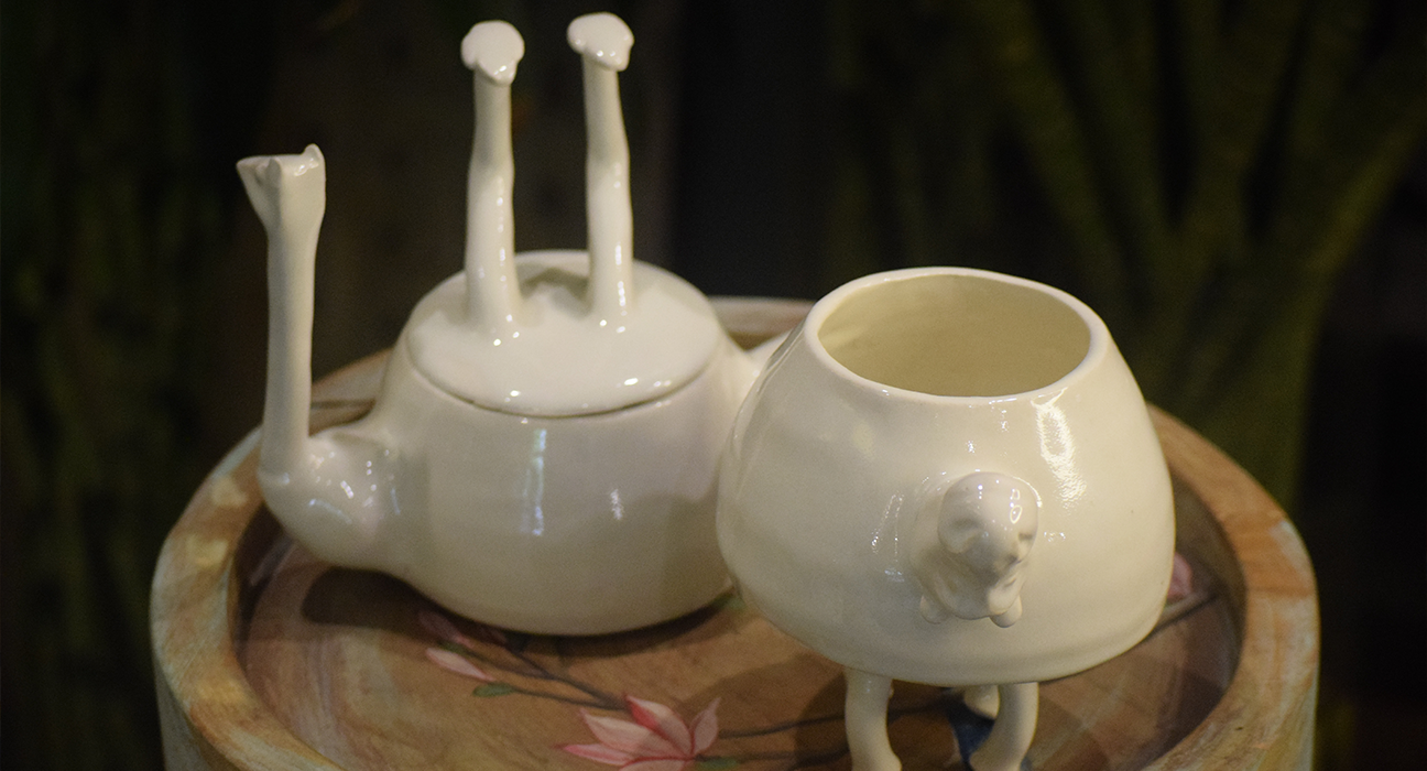
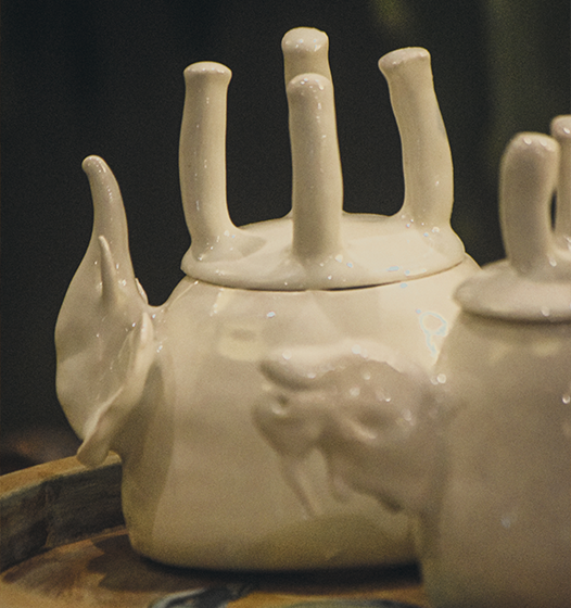
ScoopUp is a Berlin-based artisanal ice cream brand selling handmade, natural ice creams. The brand required a playful yet fresh identity to stand out in Berlin’s bustling gelato and ice cream scene.
Crowded Market: Competitors relied on loud, flashy visuals. We crafted a minimal pastel identity that conveyed freshness and stood apart.
Budget Constraints: Printing costs were limited. To adapt, we developed a flexible modular graphic system reusable across multiple mediums.
The final identity for ScoopUp Berlin is fun, pastel-forward, and artisanal, reflecting their natural vibe while standing out at Berlin’s flea markets. Deliverables included logo suite, brand guidelines, packaging concepts, and stall branding that amplified their presence in local markets.